Blog
RAFTT design diary #1
Co-designing a local history archive with Oldham residents
Local history is an area GFSC have done a lot of work in. Every neighbourhood on Earth has a plethora of stories that are completely unknown outside it. At GFSC we want to find ways of telling and sharing these stories which are compelling, well presented, accessible, easy to use, and crucially are designed and owned directly by the communities they’re made with.
Some of this work predates GFSC as a studio collective and infuses our DNA. This includes The Cassowary Project which explored Sylvia and Kim’s experiences doing local history in Hulme; Hulme History, a collaboration with urbanism co-op Urbed where we digitized their archive, made a website for it, and helped get it into the local archive; Dear Friend, a project encouraging people to write to inspiring women in history that they had a personal connection to; and most recently a community history day working with our friends The Old Abbey Taphouse.
From doing this work we know first hand how much the community history of structurally disadvantaged areas can often be overlooked and lost, which often prevents people from being able to make sense of where they are and the impact of the state on their own community. By sharing memories of place and experience, a greater sense of solidarity, connection, and community can be fostered amongst residents — past, present and future. There is also much to be learnt from histories, and by thinking and talking about what has happened in the past, we can reflect and learn, understand forces that often are outside our control, and help focus efforts for community-led social change.
What are we trying to build
As anyone who has tried to do it can attest, genuine co-production is really hard, especially when youre making something totally new. It can represent a kind of Western movie standoff where two gunmen, pistols drawn, take it in turns to say “what can you offer”… “well what can you do?”, forever. If you put something too specific in front of people, like a hammer, all of a sudden all problems look like nails. But if you don’t have anything to show, there is no potential to get a shared understanding of the problem and people don’t really know why you’re there. We therefore need to design something specific enough to get people excited, but vague and flexible enough not to put the cart before the horse. A lot easier said than done!
Ultimately, we want to create public history archives that allow the communities concerned to easily and accessibly explore and understand their own history. We want them to be able to enjoy photographs, maps, newspaper articles, letters, and all kinds of other physical artefacts, without degrading the original artefacts (as physical handling of them would do — one advantage digital archives have, as a companion to physical ones). We also want them to hear the stories of their neighbours (past and present) in their own words. This usually wouldn’t be possible without a concerted effort to collect and curate these stories in collaboration with their tellers, so this is what we aim to do.
These projects need to be free to host and maintain (so that they don’t become defunct as soon as whatever grant or donation got them up and running is exhausted), and they should also use free and open source tech, which will enable new volunteers to pick them up and run with them, and make sure that they’re easy to update for as long as people want to.
We also want to make sure that these projects aren’t just disordered dumping rounds for collections of artefacts and stories — for local history to be compelling and inviting, it needs to tell true stories in ways which are coherent and meaningful. Call that a ‘beginning, middle and end’, call that a ‘narrative flow’, but whatever it is, it ensures that the experience is more akin to reading a good book than it is shuffling through a drawer in someones desk filled to the brim with loose papers and photos.
One of our upcoming projects
The first of several local history projects we have coming up is a collaboration with First Choice Homes Oldham (FCHO). We are working with them on a new digital community history project focussed on one small area of Oldham — the project is titled ‘The Rise and Fall of Two Towers’, in commemoration of the two iconic, soon-to-be-demolished tower blocks which stood at the heart of area concerned. FCHO told us there was very little outwardly discoverable community activity, resulting in community engagement for them being a real struggle.
So, on the brink of the demolition proceedings, FCHO saw an opportunity to do some real outreach and get closer relationships with their customers. We worked with them to apply for funding from the National Lottery Heritage Fund that would expand that work into a hyperlocal digital history project.
FCHO bought together key local stakeholders from Oldham Archives, the Colosseum Theatre, and OL1 Oldham community group. Through the magic of the GFSC collective, Colleen Morgan (part of the Anarchist Archaeologist Black Trowel Collective) recruited MA student Sam Benbow to help us navigate this tricky project as part of her dissertation research.
Gathering data
Step one of any history project is to think about who the key people and events are, see what information is already out there in terms of maps and statistics, and what pre-existing themes might be explored. This phase can be very challenging where no work like this has been done before, and this area was no different.
One of the earliest findings made by FCHO was that there was very little by way of oral, photographic, or indeed any other kind of history of the area. This history currently only lives in the minds and cupboards/drawers/photo albums of those who have called the area home, and it is our job to find ways of getting this history out in a way that can be shared and enjoyed by the whole community.
The council do have some materials (like maps, newspaper articles, and limited photography) in their archives, so these materials could act as valuable prompts in helping members of the community step up and share their reminiscings.
At present, FCHO are attempting to find and contact current and former residents of the area, to see if they would be willing to tell their stories to us. They have done this through events (an afternoon event at a local community centre, and a stall at the local market), and through leveraging their individual contacts to follow up with people directly. They are also advertising on local notice boards and on social media.
Sam is conducting in depth interviews with participants who are willing, offering them a series of questions and prompts to try and get out as many stories and anecdotes about the area as possible. Alongside the council’s archival materials, we are also asking participants whether they have any materials of their own to share, like photographs or other artefacts that relate to the towers or the area immediately surrounding them.
Sharing the data
Of course at this stage, we don’t really know what the overall history data set will look like. Will we unearth a huge treasure trove of photographs from the past in someone’s cupboard? Will we find an interviewee who offers loads of incredible recorded oral testimonies that they’re happy to share? Will the social media campaign really take off, and we end up with loads of tiny text-based snippets of anecdotes?
Whatever form our data set takes, it’s still important for us to start considering how we might build the eventual online digital history project with it, which will take the form of a user-friendly (back and and front end!) website.
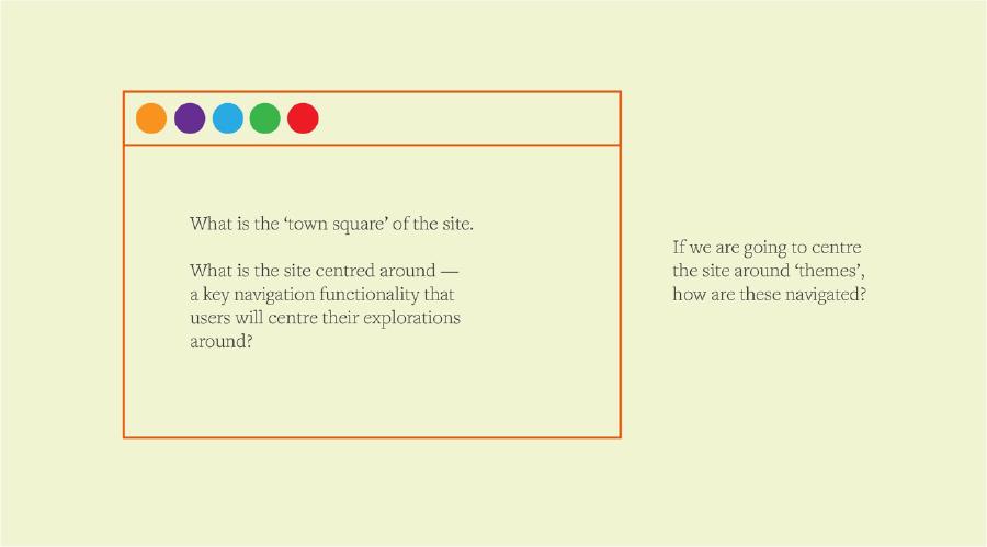
Last week we had a great opening discussion about the kinds of questions we need to ask to build this sort of site, and how we might answer them. The illustrations in this piece are the sketches we created on the fly as we talked.
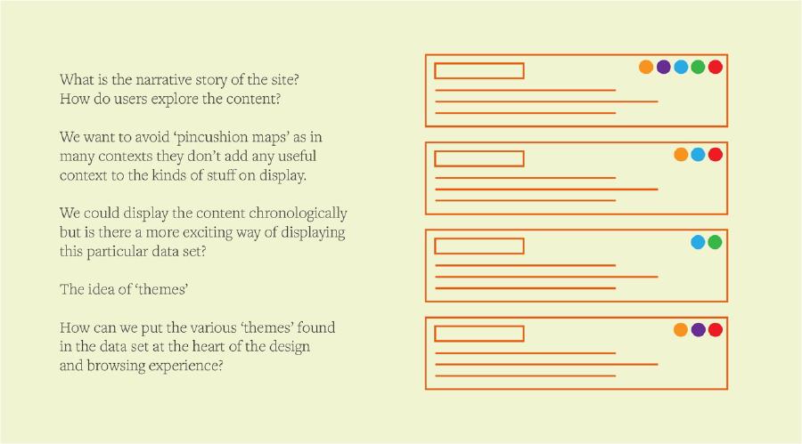
We started off by asking what the narrative order of the site might be. How do users explore the content? What is the ‘town square’ of the site — the space it is centred around, the key navigation which users will base their explorations around?
Kim has written in the past about why ‘pincushion maps’ are a bad idea, and indeed we are keen to avoid this approach here. Our previous local history site Hulme History (http://hulmehistory.info/) was centred around a map, but also around a chronology, and aimed to show how the map had changed and developed over time.
For this project though, a map doesn’t necessarily feel like the correct narrative device to base it around. While it may offer some interesting context on some of the materials, the geographic area being covered here is small, and centred around two tall towers, which means a lot of the data gathered may end up lumped together on those two specific points. (However the project does also cover the wider area, so we couldn’t make, for example, side-view graphics of just the towers showing where individual events happened from that view).
Another reason why centering the map isn’t a great idea here (or indeed, in many local history projects) is that some ‘items’ (events, movements, or people) simply cannot be pinpointed to one individual location.
So with mapping/geographic data ruled out, what other facets of this data set might we consider the “primary axis” to base the structure and narrative of the site around? We initially talked a lot about whether a ‘timeline’ would be a good concept here. Sometimes this works wonderfully as a narrative device, but with larger or more fragmented data sets (of which this could yet prove to be either), it can feel either overwhelming, gappy, or simply irrelevant to the larger narratives at play.
Themes
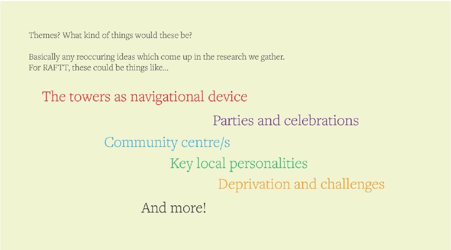
We started talking more about the notion of ‘themes’. This is a less quantitive way of defining data, which in many senses makes it more personal. It is of course important to ask who defines what themes are centred… Do stories end up being silenced if they don’t fall within particular theme categories? These are concerns we need to be mindful of, as we explore our growing data set and figure out what themes are emerging as more and more people contribute to it.
But regardless of these considerations, it feels to us like an exciting and engaging way of organising and exploring the stories of an area, and offers perhaps more of a ‘way in’ than some of the more quantitive, factual breakdowns we could otherwise have used.
Some emerging themes so far include:
- The towers as a navigational device
- Parties and celebrations
- Community centre/s
- Key local personalities
- Deprivation and challenges
And more still growing and forming.
It will be down to us to consider how many and what themes to centre the website around in the final design.
Thinking about design
We started to loosely consider the structure of a site like this, starting off by reflecting on the successes and failures of Hulme History.
If there no longer needs to be a map at the centre of the site, what is the core navigation? How can we make this site exciting and easy to use both for someone who just wants to dip in and out of the stories, and also for someone who wants to read the entire archive from cover to cover?
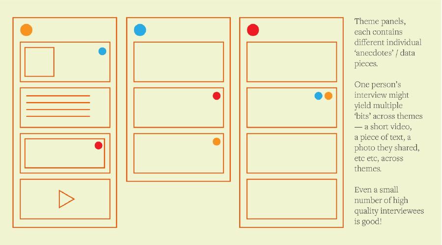
We also want to come up with a system that will work whether we end up with a small number of high quality/in-depth contributors, or a large number of small scale contributors. So rather than thinking of an hour long interview conducted on zoom as one piece of content (which more than likely, no one would ever listen to in full), we can think of it as a number of smaller pieces. We can transcribe some sections of it into text, we can export out some sections as short audio recordings, and maybe we can even source imagery to accompany some of the anecdotes we are told.
With this in mind, we are thinking of our content as easy to consume, bitesize ‘snippet’ anecdotes, which will hopefully span a variety of media.
We returned again to thinking about narrative — the story the site tells at any individual moment, no matter where an individual is in their exploration of it.
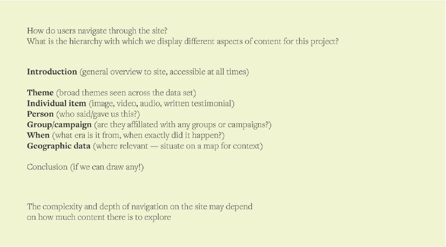
All stories start from a beginning — an anchoring point to get you into it, even if the project is, as discussed, not in chronological order. We will need to figure out how this overall introduction and starting point manifests itself.
The middle of the story (the largest, and most complex section), is the exploration of our many ‘snippets’ — as mentioned, the ‘way in’ to these snippets will be by theme, but of course each item will have other data associated with it (’metadata’ if you will) — things like who gave it to us, geographic location (in some cases), when it happened, whether there were any groups associated with it, and so on. Some snippets may also overlap across themes, so might appear in multiple places. (Though does this make it harder for those who want to read the site ‘cover-to-cover’ in a more linear way? Does this matter?)
As for the ‘end’ of the story… Well, is there an end? We discussed whether the site will draw any conclusions, or perhaps the ‘end’ will be an invitation to ongoing contributions, as we do want the site to grow and be added to over time, rather than being a site which begins and ends with our initial build. (The site will be built as a static site, and training will be offered to members of the community and the team at FCHO so that it can be maintained and added to in the long term).
Structure
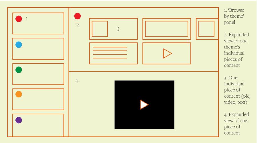
We looked at our old Hulme History site (http://hulmehistory.info/), and decided to use that as a jumping off point in considering panel based navigation styles. The design/layout sketched here is arbitrary, these ponderings were more to think about navigation and site structure.
Shown here, to the left, is a ‘themes’ panel, which would be constantly visible, or at least accessible. To the top right is an expansion of one of the themes, showing all the individual snippets which are contained within that theme. Any one of these snippets can be clicked on and expanded into the panel below (bottom right).
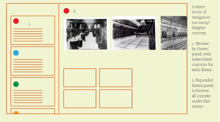
We did discuss whether maybe three levels of navigation was simply too many, so created an alternative where the themes panel also contains a short ‘contents’ for each theme (partial or full?) and on click a user can explore all the contents of that theme in the panel to the right.
One idea is that we want appropriate contextual information to appear whatever snippet a user is looking at. Is it super relevant where this was on the map? Then we show it. Is it important that someone knows immediately what happened before and after this? Then maybe it does appear on a mini timeline. Was this photo supplied by a particular local group or body? Let’s name them and allow the user to easily access their story.
This was as far as we got in our first discussion — and of course this still feels very rough and open ended, and we need to figure out how a lot of things work.
My (Emma) background is in graphic design for print, so I have a tendency to need to imagine how any given content will fit into a space. I am enjoying learning to think about things in a different way, centering the community and their stories, and researching how best to give these stories back to them in a way which is accessible and has the longevity it deserves.
More soon, I hope!